What Makes a Good Dyslexia Font?

My name is Bob Hext, and I am the Director of my family-run business of 30 years, Crossbow Education. I was previously an SEN teacher and found that the games I taught my dyslexic students were more effective than any published materials at the time. As a result, Crossbow Education is the UK brand leader for visual stress products, with reading rulers and overlays in over 60% of the schools and colleges in the country.
Visual Stress In a Nutshell:
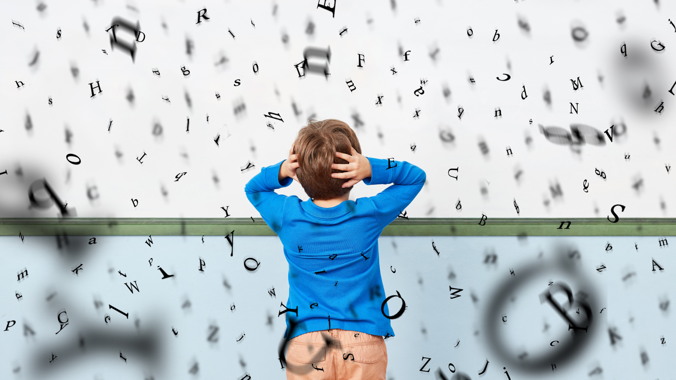
Visual stress or difficulties are often associated with dyslexia but can exist independently. Challenges that are perceptual and stem from the visual cortex rather than the eye are often termed "visual dyslexia." Still, they do not have dyslexia and should not be confused with it. Visual stress is a scientific term for this set of difficulties, which causes distortions and discomfort, making reading challenging and tiring. Symptoms vary but can include headaches and migraines (especially when working at the computer), eyestrain, and words or letters appearing to "jump" or move on the page. In addition, people with these difficulties see the page differently because of the print or white background distortions.
With decades of experience working with children and adults with dyslexia, I wanted to design a font that facilitates reading, alleviates visual difficulties, and improves reading speed and comprehension.
The Purpose of a Typeface
A dyslexia font is, as the name suggests, a font that makes the text accessible for people with dyslexia. However, as educationalists began to realise in the 1980s when dyslexia began to be recognised as a learning difference (in those days, it was termed a disability, but – hopefully – we know better now!), what works well for a brain that's wired for dyslexia works well for everybody else as well. The same applies to a dyslexia font: the primary purpose of a font is to lead the brain to the content of a piece of text without its appearance being an obstacle. Except in the case of decorative fonts, the font isn't there to draw attention to itself but to the word for which it is the medium. This is particularly important for a dyslexic person, especially fonts with co-occurring visual difficulties ("visual stress"), where the actual representation and sequence of the letters in a word is an obstacle to understanding.
A Hidden Dimension of Improved Experience
However, most people do not realise that a neurotypical person's reading experience can be improved if a dyslexia font meets specific criteria. Just as adults diagnosed with visual stress for the first time often say how they thought their discomfort and difficulty was actual of everyone's reading experience and are astounded by the difference that is reading through the right colour can make, it is also true that there is a hidden dimension of improved reading experience that the average neurotypical reader can access just by replacing their standard typeface – Arial, for example – with the right dyslexia font. So what makes a good dyslexia font- in particular, one that does not shout" accessibility" all over the page but that can be used comfortably by everyone on any document, whether digital or printed, in any environment?
Reduced Pattern Glare
As I have already suggested, a significant consideration is that it doesn't look too out of the ordinary. It should "disappear" as much as possible rather than stand out. For reading to be quick, efficient, and comfortable, the font must minimise the effort required to decipher the words so that "brain space" for understanding is maximised. The words must sink in rather than pass in front of the eyes. Three principles can be applied to achieve this. First, a good dyslexia font must reduce pattern glare from black text on a white background and not use "Look out!" or "Look at me!" features that excite the brain's visual areas.
Unique Characters
Secondly, each letter needs to be unique and easy to recognise. For example, the letter 'b' must not just be a reversed 'd'. The brain can respond to quite subtle cues to differentiate between characters. Still, if they are not there, reversals and other confusion can run riot for someone with dyslexia and visual difficulties.
Keep Verticals
Kerning (the spacing between letters) must be such that enough space is left between verticals (especially between me and l) to stop them from running together without so much that the eye's saccades between the letters are interrupted or slowed down.
The Natural Choice
The Aravis font, based on algorithms found in nature, was designed over five years to achieve these objectives. In addition, the font size and spacing are such that a paragraph in Aravis takes up roughly the same space on a page as, say, a section in Arial or Calibri, so they can be substituted on most documents without making significant alterations to the layout. And with 1500 glyphs for each of the six typefaces, covering all 72 Latinate languages + Greek, Aravis is not just an alphabetic dyslexia font for the English-speaking dyslexic community. Still, it is a significant contribution to international typography. (Aravis is the Crossbow house font).
- Aravis Dyslexia Font
- Reading Rulers
- Overlays
- Monitor overlays
- The visual stress assessment pack
- Tint and Track Software
Please let us know what you think in the comments section below.


.png?width=352&name=maths_homework%20(2).png)
